



53 Prospect Road
Gaythorne, QLD 4051
Australia


A brand is more than a logo: it is a gut feeling, and gut feelings are built from repetition. When a brand looks different in every place a customer meets it, that repetition never happens, and trust quietly erodes. Most businesses arrive here the same way. The logo was fine. Then came a website, a tender document, a trade stand, a uniform and six years of staff making their own version of the slide template, and now nothing quite matches.
We build brand identities as systems rather than as logos, because the logo is the part your audience sees least. What they actually encounter is typography, colour, layout, photography, tone of voice and behaviour, applied the same way every time. Get the system right and the brand holds together in the hands of people who have never spoken to us.
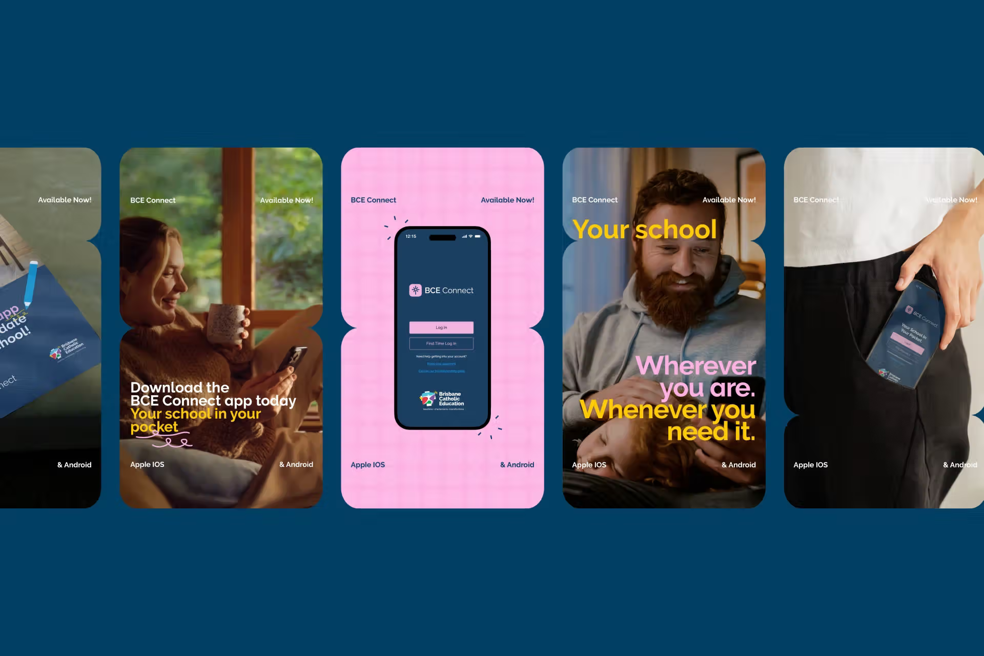
A full brand identity covers visual and verbal language, and extends into naming, motion, sound, packaging and launch where the brand needs it. For BCE Connect it had to survive being an app icon in the pockets of more than seventy thousand parents, carers and teachers. For PMG it had to carry the idea of places made for generations across property developments that will outlive the brochure. For Ernest Performance it had to look as engineered as the product.
Rebrands are the larger share of our work, and they are a different discipline to launching something new. There is equity to protect, staff to bring with you and customers who already hold a picture of you in their heads. We will also tell you when what you need is a refresh rather than a rebrand, which is smaller, cheaper and often the better answer.
Branding suits businesses whose reputation has outgrown their presentation, businesses merging or acquiring, and anyone whose identity was built for a company smaller than the one they now run.
Eight parts of an identity. The logo is one line in one of them.

Logo, typography, colour, layout, photography style and graphic devices, designed as one system. We design for the hardest applications first, like an app icon or a twelve-metre site hoarding, so the easy ones take care of themselves. If it only works on a white background, it does not work.
How the brand sounds: its voice, its vocabulary, its key messages and the words it refuses to use. Written down with examples, so a new hire writing a job ad and a director writing a tender sound like the same business. Words are half the brand, and usually the half nobody briefed.
How the brand moves on screen. Logo animation, transitions, type behaviour and pace, set as rules rather than one-off effects. Most people now meet a brand on a screen, and a brand that only exists standing still is missing a dimension.
What the brand sounds like when nobody is speaking. Audio logos, music direction and sound for video, podcasts and events. It is the most overlooked sense in branding, and one of the hardest to forget.
Names for a business, product or venture that carry meaning and leave room to grow. SPOT Consultants and Goodwork HR both started here. A good name does work in every conversation for years. A weak one needs explaining in every one of them.
The rules that let other people use the brand properly when we are not in the room. Practical, built around real examples, and not a hundred-page PDF that lives in a drawer. Good guidelines get used. Great ones make the right choice the easy one.
How the new brand arrives. A roll-out plan, launch assets, signage and digital changeover, and briefing your own team first so they are its first advocates rather than its first critics. A rebrand that sneaks out quietly wastes most of what it cost.
What happens after launch. We stay on as your away team to keep the brand consistent, evolve it as the business grows and produce the work at the standard set on day one.
The identity is the system itself: the logo, colour, type, imagery and voice. The guidelines are the instructions for using it. You need both, because an identity nobody knows how to apply starts drifting the week it launches.
No. Most roll-outs are staged, starting with the places customers see most and working through the rest on a planned schedule. What matters is that everyone knows the plan, so old and new don't sit side by side by accident.
Early, and before the customers. Your people are part of discovery, they see the reasoning before they see the logo, and they hear about the launch from you first. A team that understands why the brand changed will defend it.
The full system and the means to use it: logo suite, colour and type, graphic elements, imagery direction, tone of voice, templates where you need them, and guidelines that explain all of it. The exact kit is set in the scope, because a sports club and a construction group need very different things.
