












53 Prospect Road
Gaythorne, QLD 4051
Australia





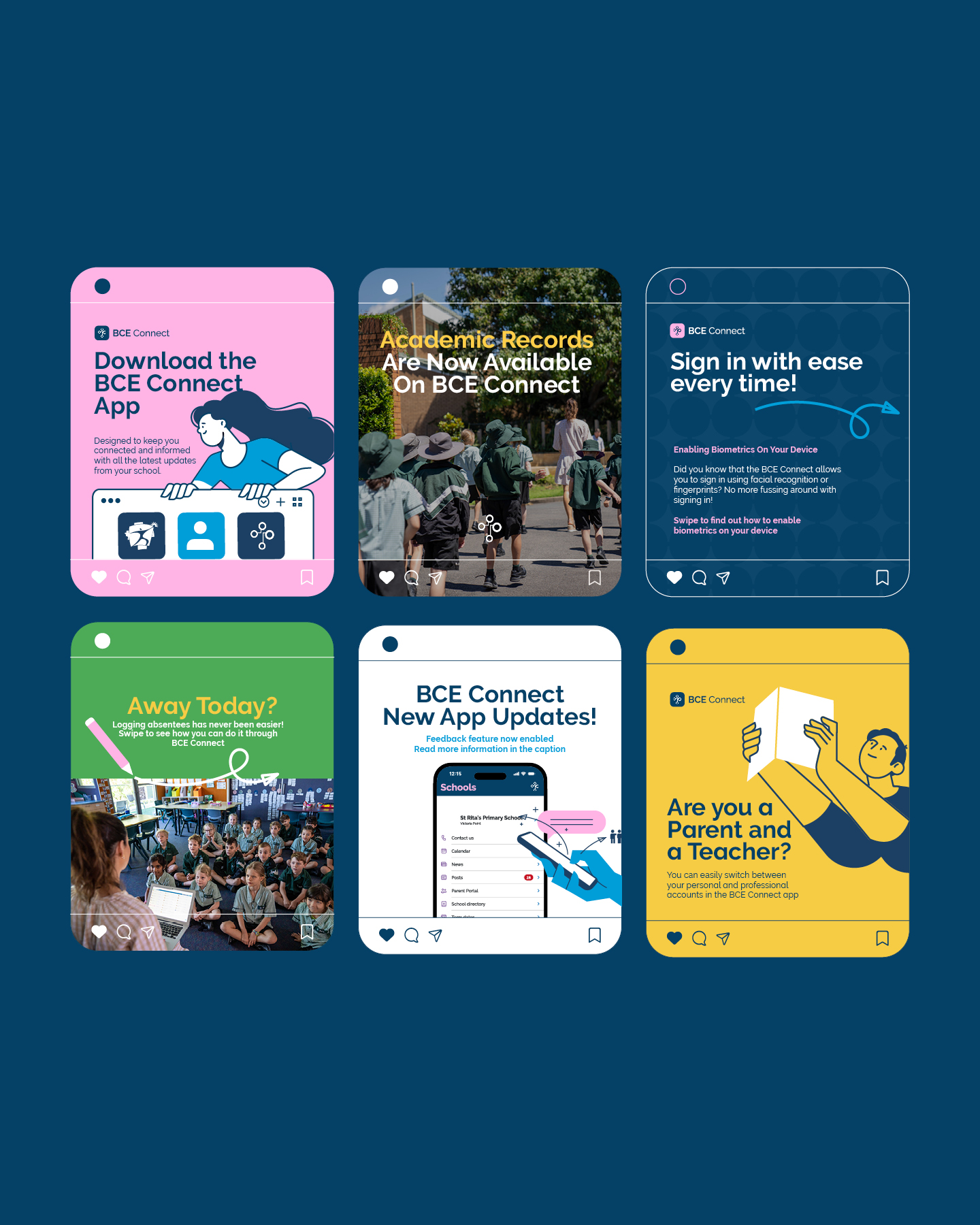
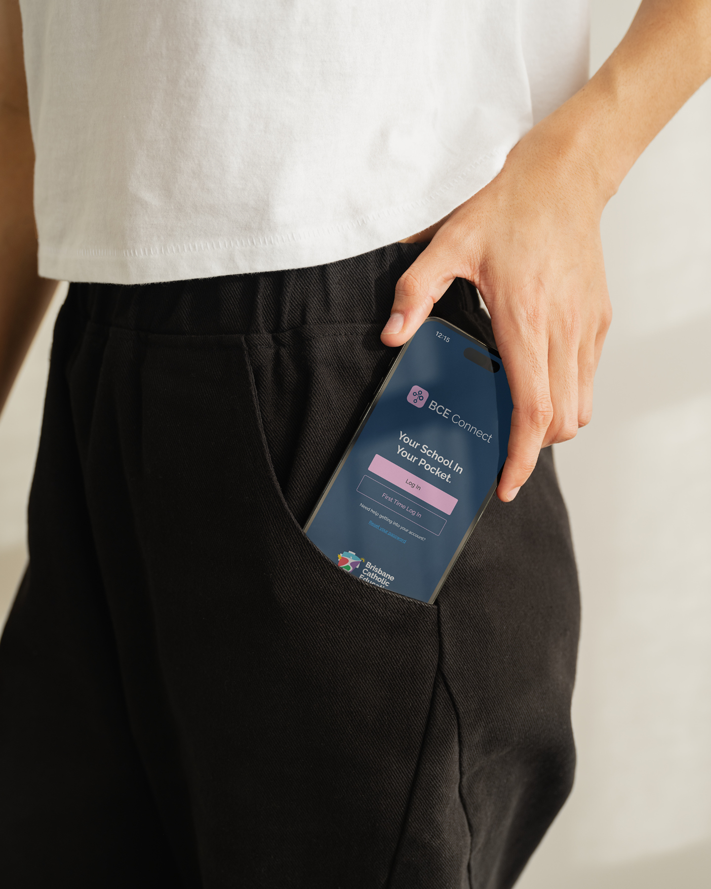
BCE Connect lives on the phones of more than 70,000 parents, carers and teachers. It is how an entire school community keeps in touch.
So when Brisbane Catholic Education asked us to rework the identity, the real brief was simple: get people actually wanting to use it.
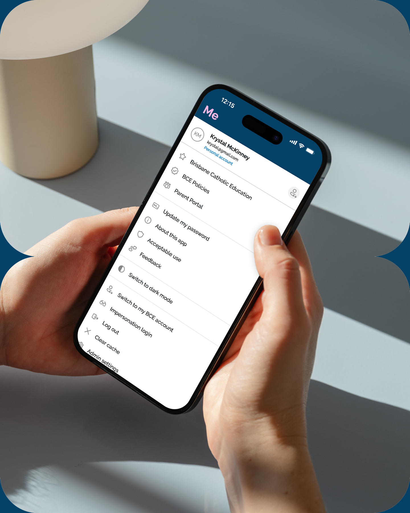
BCE Connect can do a lot. Log an absence from the car park. Read the latest school news. Pull up a report card. Get a push notification the moment something changes.
Most parents didn't know that. A good number didn't know the app existed at all. The ones who had downloaded it tended to open it for one thing, do that thing, and close it.
The app itself wasn't the problem. The way it presented itself was. It looked and felt like software. Functional, cold, a little clinical. Nothing about it suggested there was more inside, and nothing about it made you want to look.
That is a brand problem, not a product problem. Which is where we came in.
We spent four months on strategy before touching the design.
That meant extensive workshops with the internal BCE teams, learning the product inside out, and understanding the people who open it every day. What they came to it for. What they didn't know it could do. What would make checking it feel like second nature rather than another admin task.
The insight that shaped everything was straightforward. Parents weren't avoiding BCE Connect. They just had no reason to think of it as theirs. It had no personality, so it gave them nothing to connect with beyond the task in front of them.
Every design decision came back to that.


.avif)
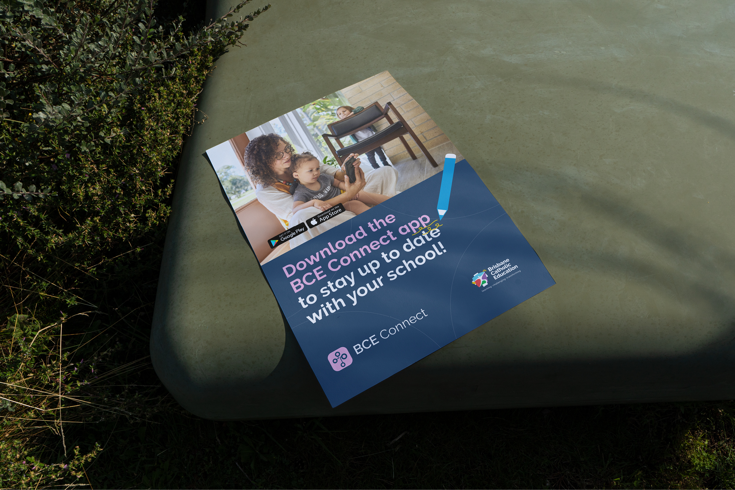
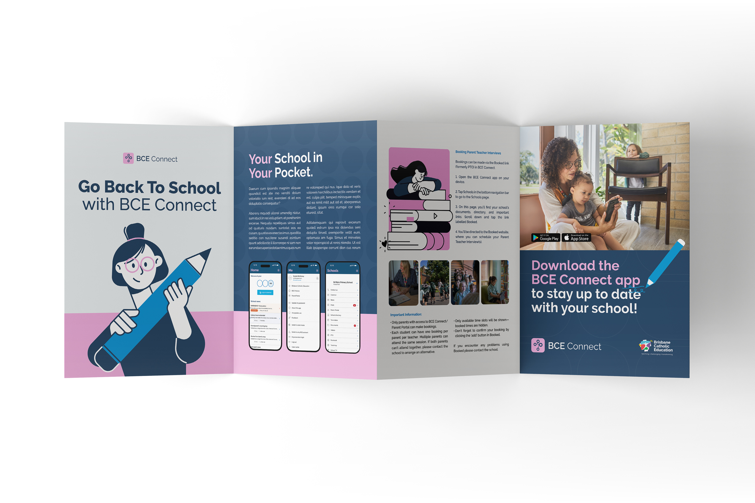
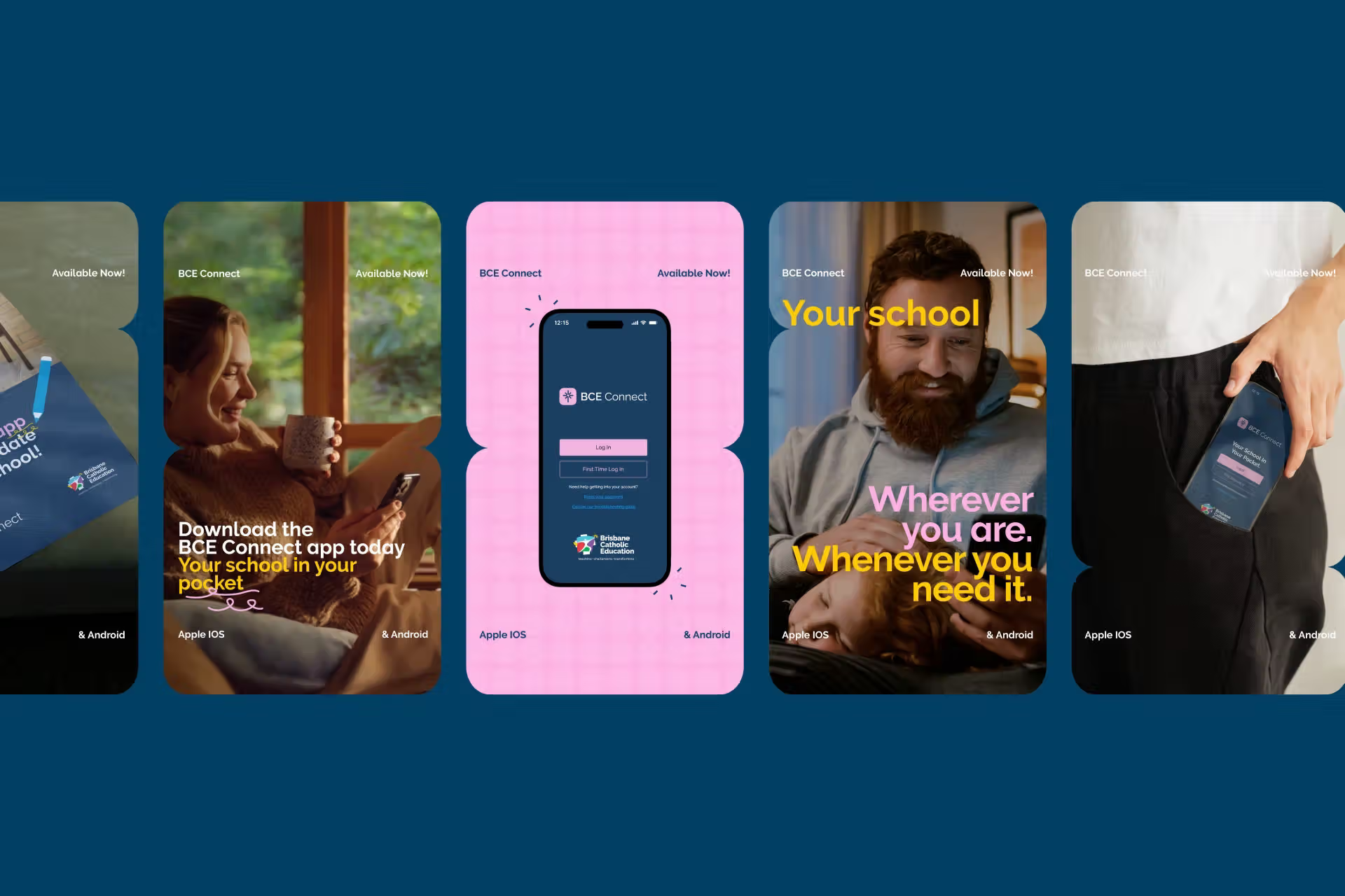
The new identity system is designed for real life. School mornings, pickup lines, the five minutes between meetings when you remember you need to log tomorrow's dentist appointment.
It is playful without being childish, warm without being soft, and clear enough to work at a glance on a phone screen held in one hand. We built out the full system alongside content, art direction and messaging, so the tone of the writing does as much work as the visuals in making the app feel like it belongs to the community using it.
We proposed a new logo as part of the work. BCE chose to keep their existing one and ran with everything else.
Since launch, BCE Connect has seen an increase in both engagement and user uptake. More people using it, and using more of it.
The app didn't change. What changed is that people now want to open it.
Education brands carry a particular weight. You are talking to families, staff and students at once, and the tone has to hold up across all three without going flat.
Stoop® works with schools, education providers and the platforms that serve them, from brand strategy and identity through to the content and messaging that brings it into everyday use. If you have a product your community should be using more than they are, that is usually a brand conversation.