







53 Prospect Road
Gaythorne, QLD 4051
Australia


Psychology practices tend to look alike. Soft blues, a lotus or a leaf, stock photography of someonegazing thoughtfully out of a window. The category settled on a visual shorthand for calm a long timeago and has mostly stayed there. It is safe, and it makes it very hard for any one practice to beremembered by someone who is comparing four of them in a browser tab.
Green Light arrived with an advantage most practices do not have. The name already carried an idea. A green light is permission to go, the moment something is cleared to start. Nothing about that is passive, which makes it a far better fit for what therapy actually asks of people than anything soft and floral.
The practice was new and still finding its shape. The brief covered children and families alongside adults, so the identity had to work in a waiting room with a six year old in it and in a session with an adult who has spent a decade avoiding the same conversation. It also had to survive a long list of small, unglamorous applications: worksheets, folders, appointment cards, a sign on a street in Brisbane.

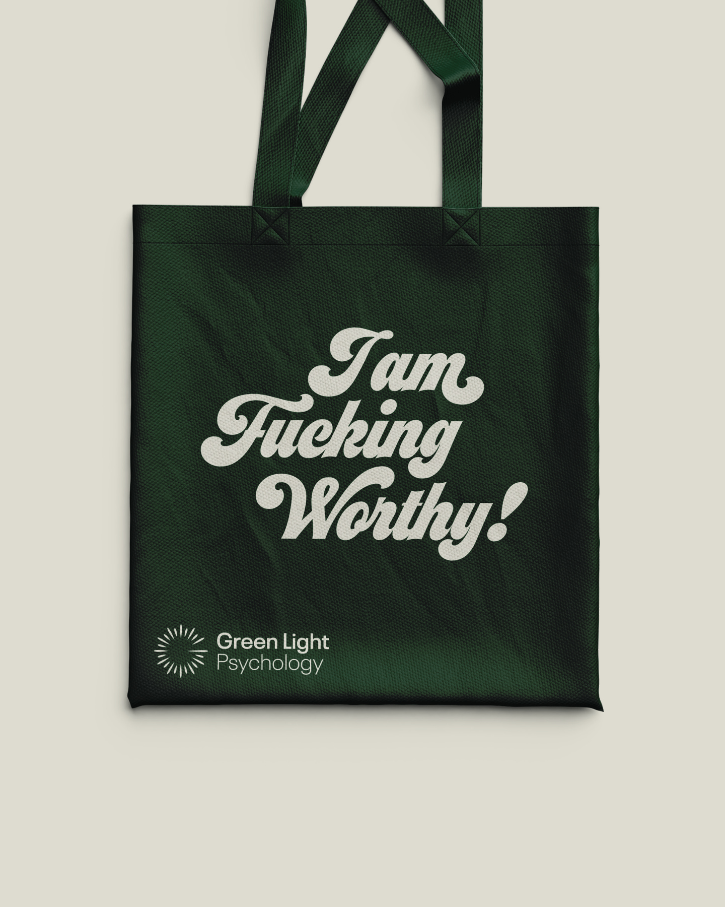
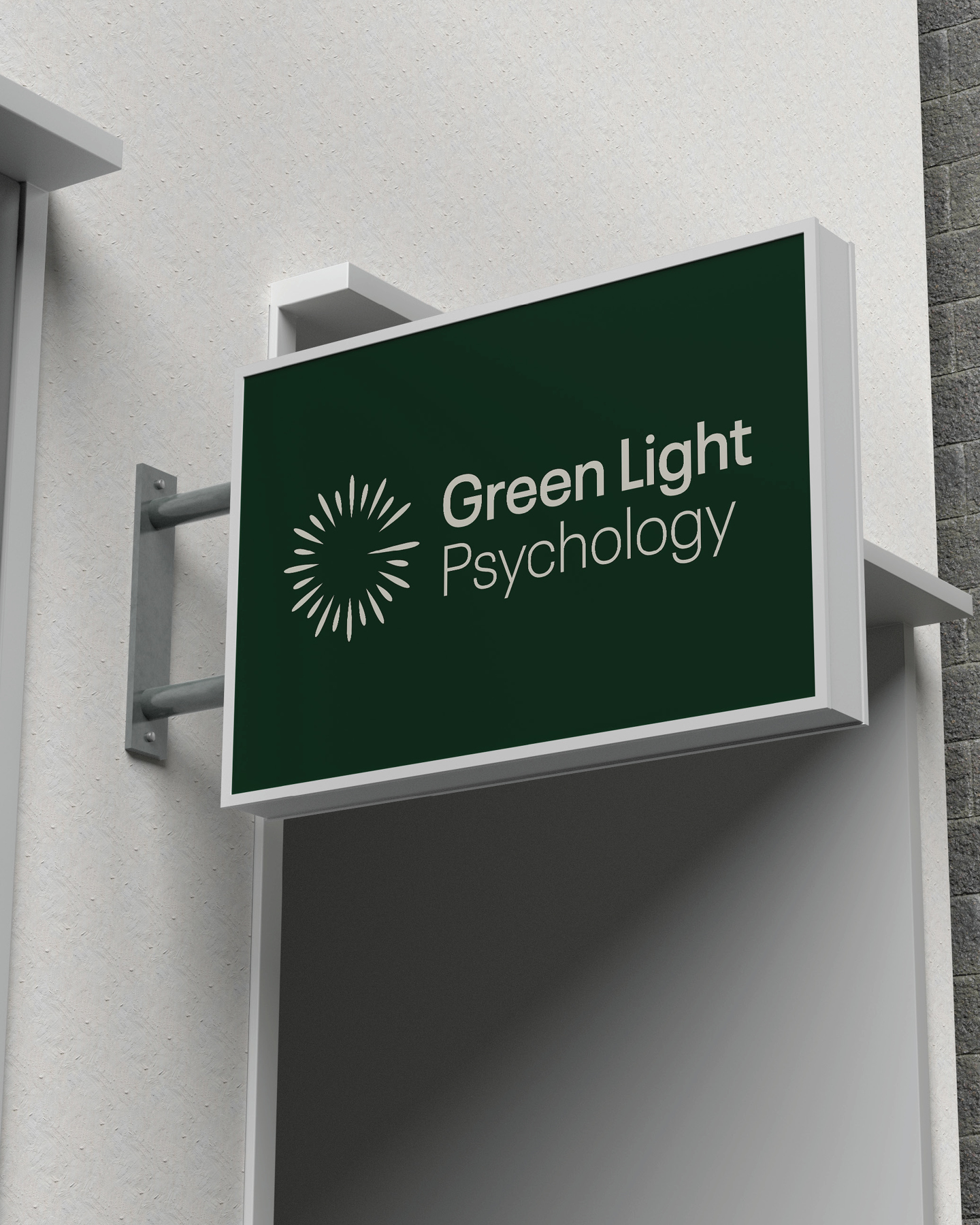
We started with the name. We landed on Green Light, as it carried so much meaning but also shared the same initials as Geneveives name.
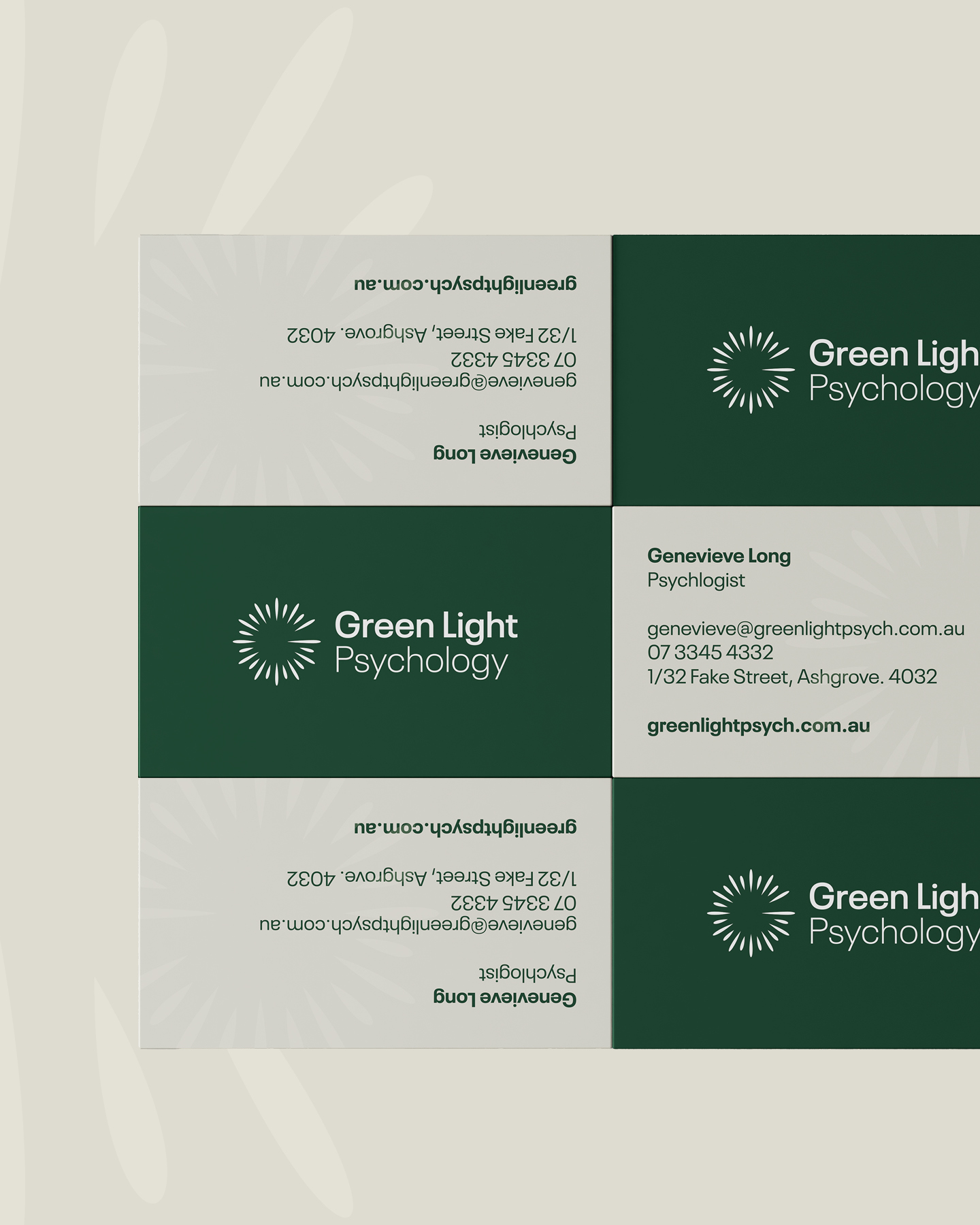
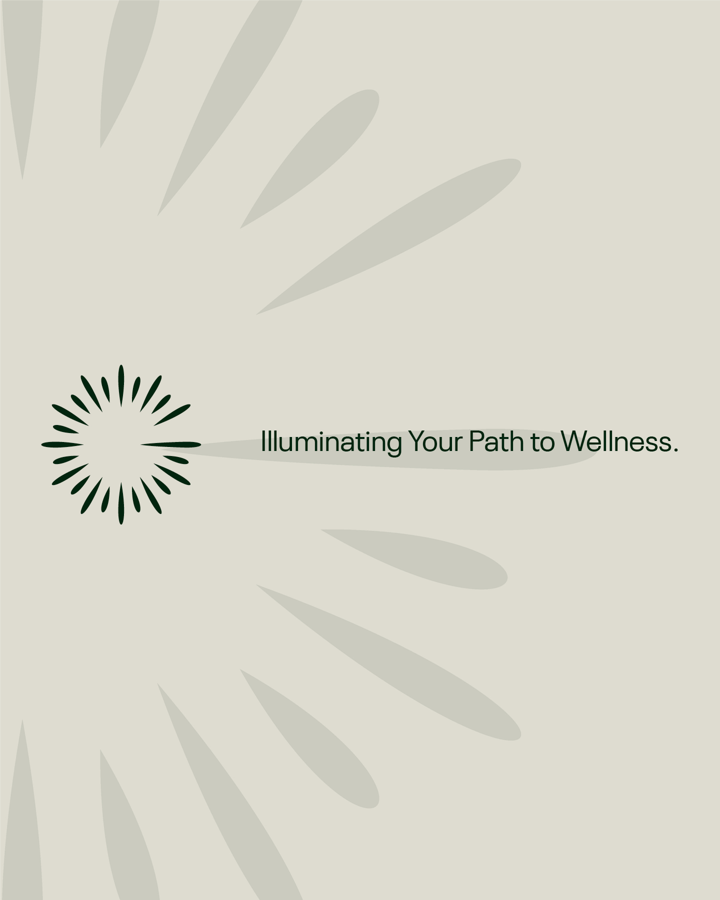
The mark is a burst of light, drawn as a ring of short tapered strokes with a deliberate break in it to form a letter 'G'. Read one way it is a light burst. Read another it is a spark, or the moment before change happens. It is hand-drawn enough to feel human and geometric enough to hold at business card size and at the scale of a sign above a door.
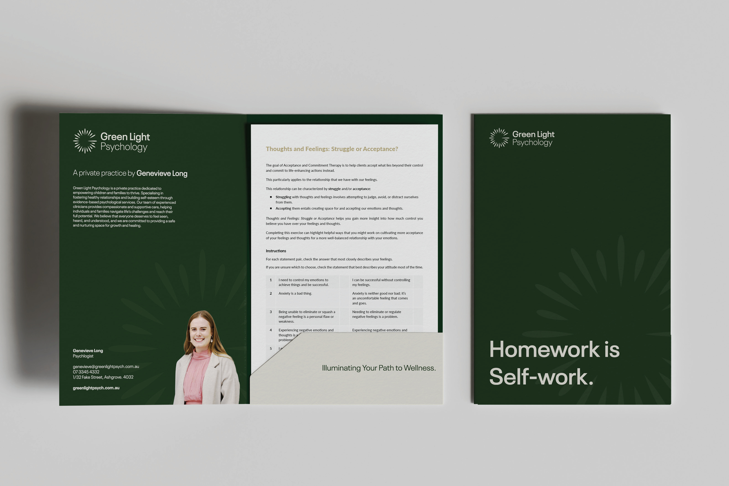
Colour does the rest. Deep forest green and warm bone, with gold for the pieces that deserve a little ceremony. No clinical blue anywhere. On top of that sits a verbal identity built around one line,Illuminating Your Path to Wellness, with a family of supporting lines underneath it so the practice has something to say in more than one register.
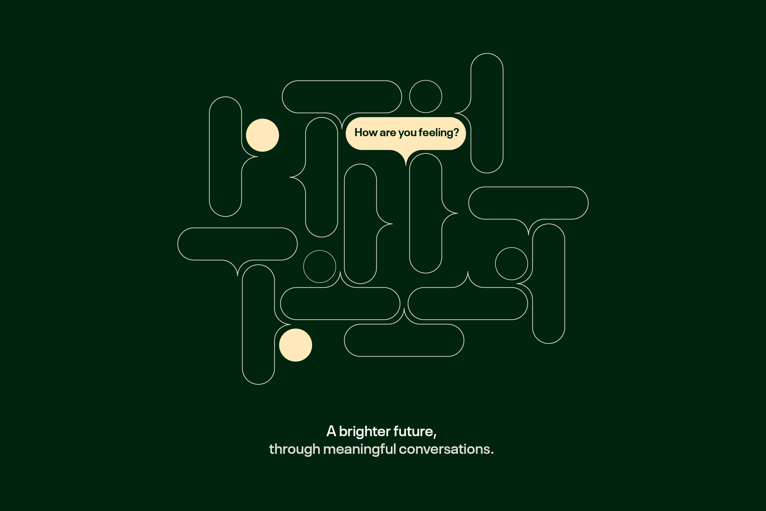
The graphic device came out of what therapy actually is. It is a conversation, so the pattern is built from interlocking speech bubbles, one of which turns green and asks how you are feeling. Across print it turns a plain surface into something that behaves like a brand.
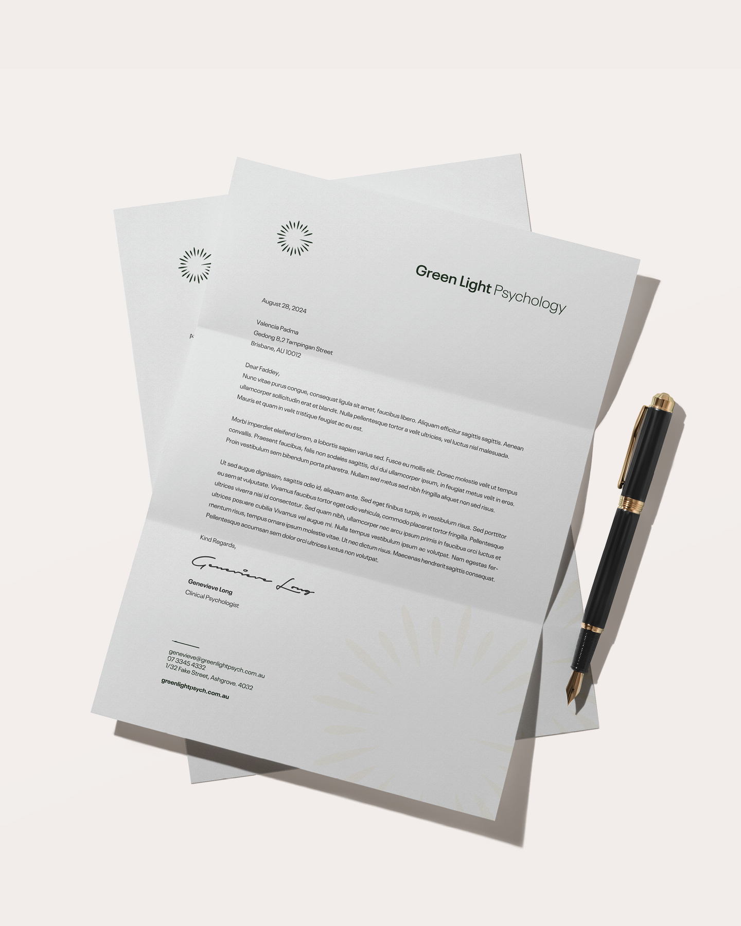
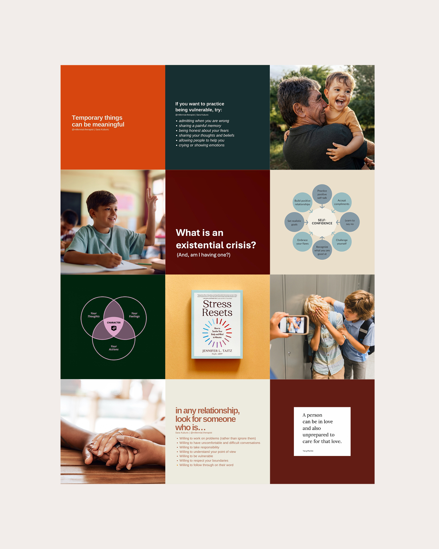
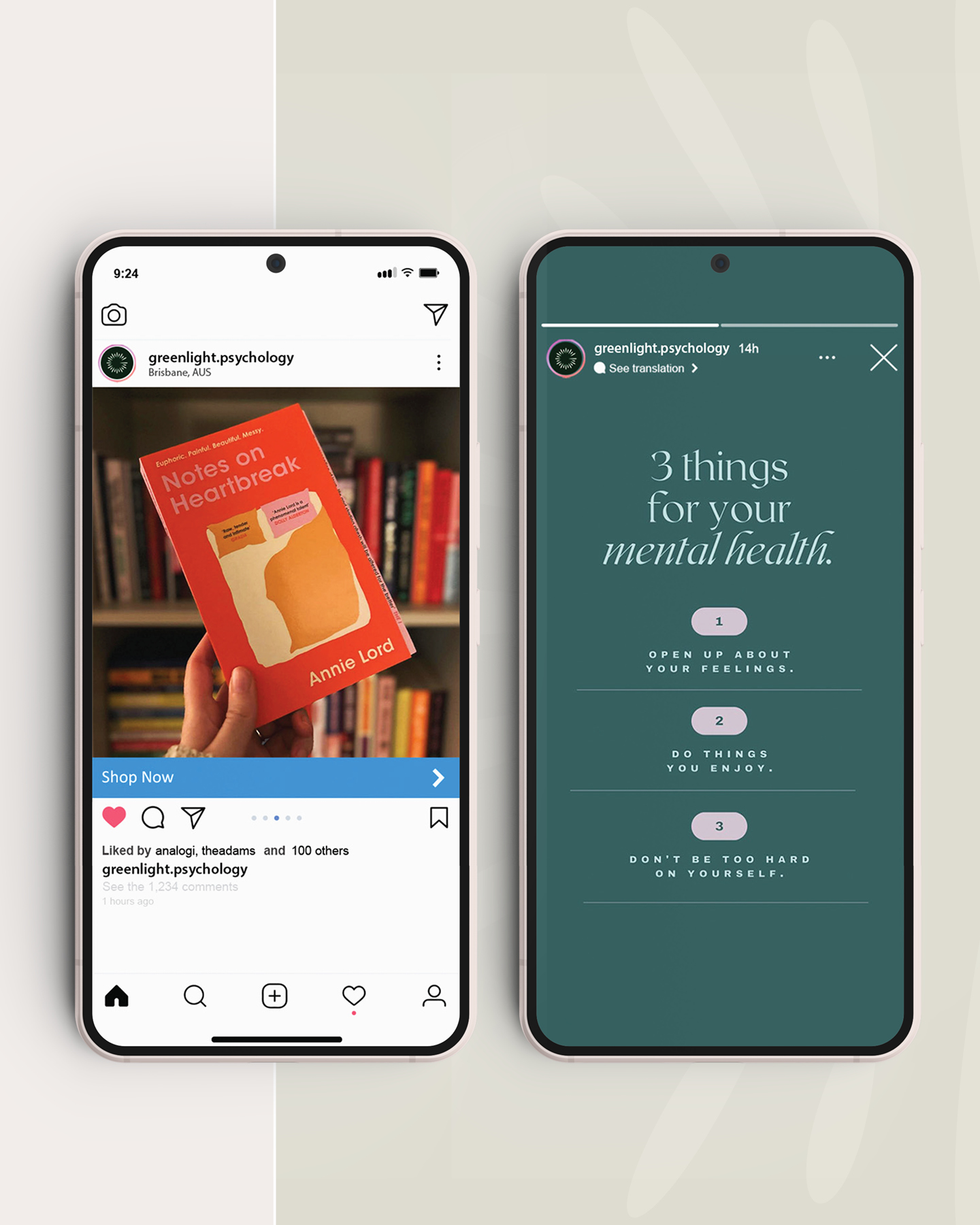
Then we rolled it out properly. Stationery, business cards, the client folder that goes home after a session, worksheet templates, a brochure, signage, and a social system with a brighter secondary palette that gives Instagram somewhere to breathe without breaking the practice's calm.
The practice has narrowed since launch and now works mostly with adults. The identity has not needed redrawing, because it was built on the name and the idea underneath it rather than on one audience.