








53 Prospect Road
Gaythorne, QLD 4051
Australia


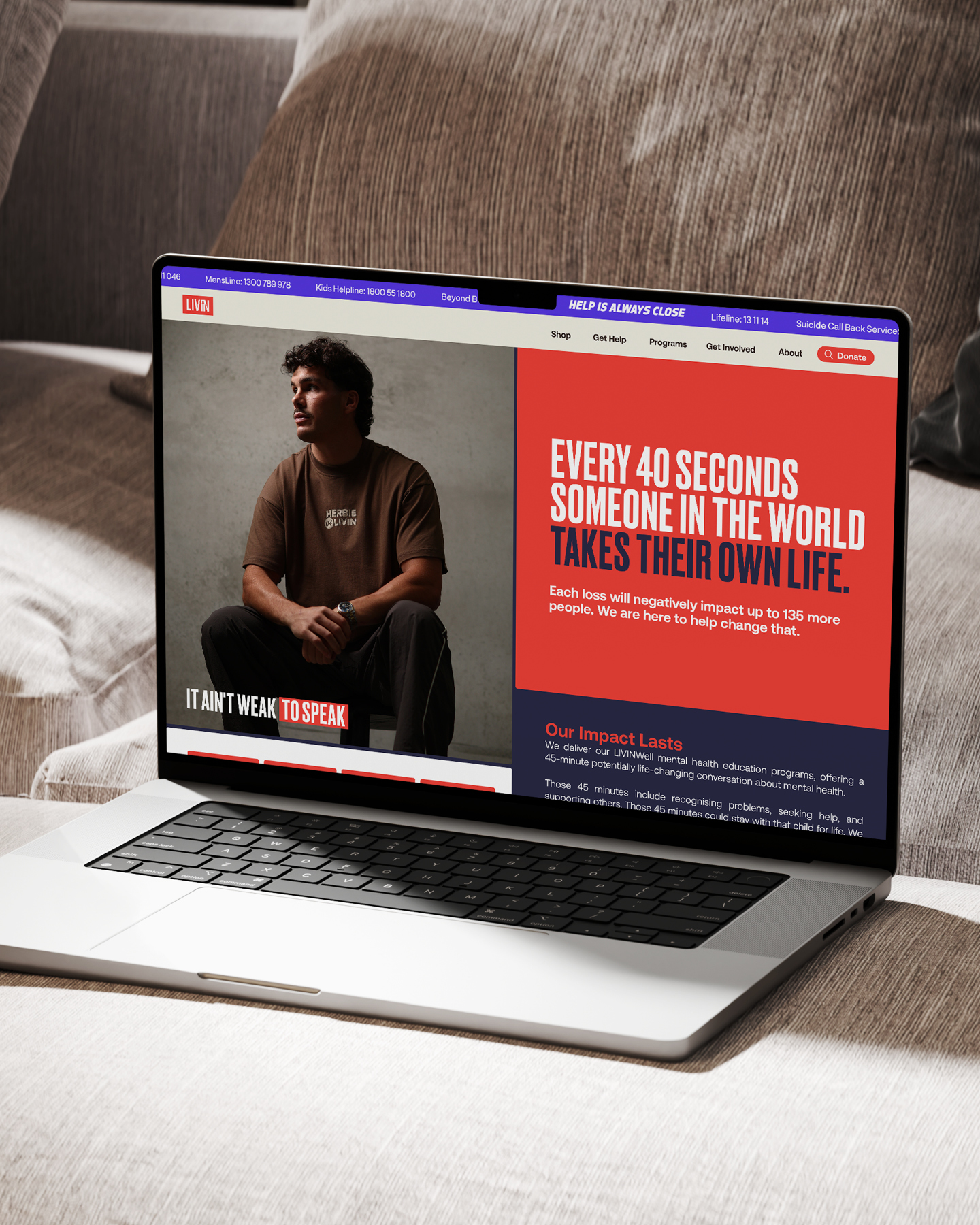
LIVIN already had the hard part sorted. They're in schools, workplaces and community clubs having conversations that change lives, and "It Ain't Weak to Speak" says more in five words than most brands manage in a page.
The brand just hadn't had much love lately. Visuals, messaging and design processes had drifted apart, and the team weren't excited by it any more. Work this good deserved a brand that looked the part.
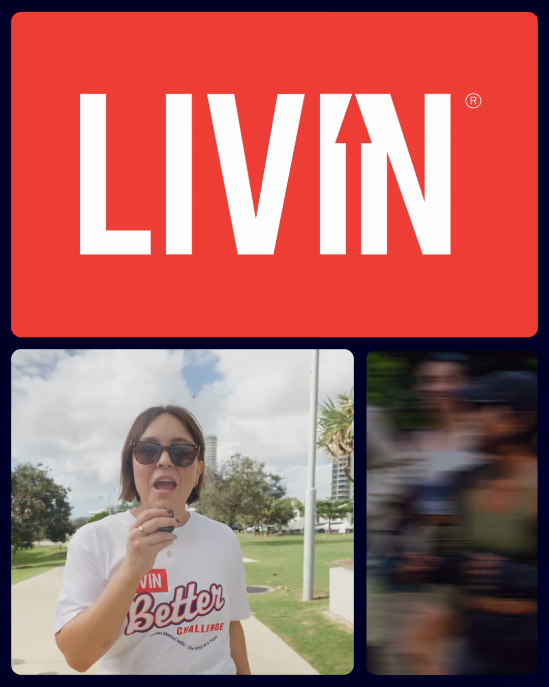
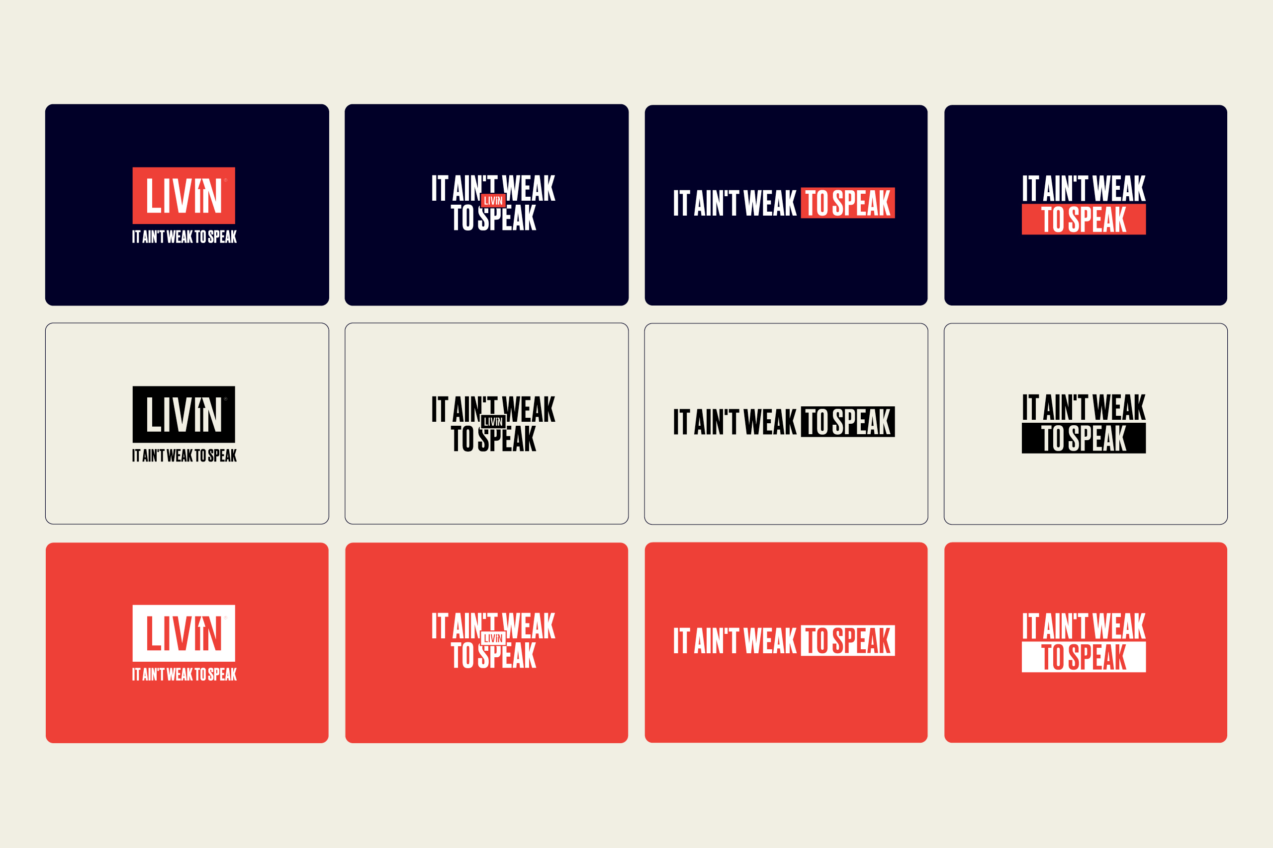
The brief came with two non-negotiables. The logo mark stays. LIVIN Red stays. Everything around them was ours to build: a new palette, new typography, and a visual system to help the message cut through.
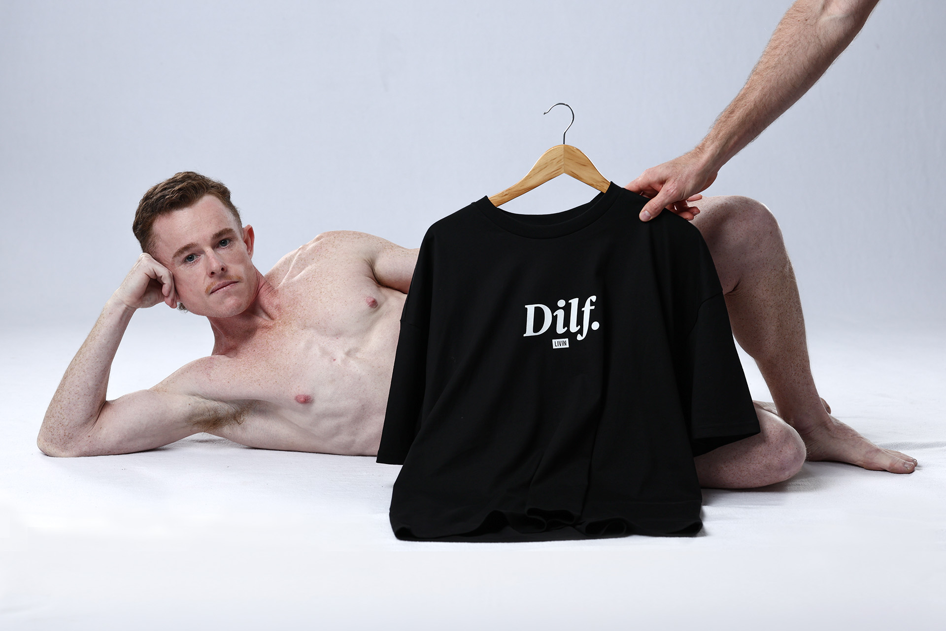
LIVIN's core supporters were Australians aged 27 to 38, and they came in two groups. Men who value sport and mateship, feel the quiet weight of being a provider, and often find LIVIN through their own mental health struggles. And mission-driven women who connect with the purpose, the authenticity and the merch.
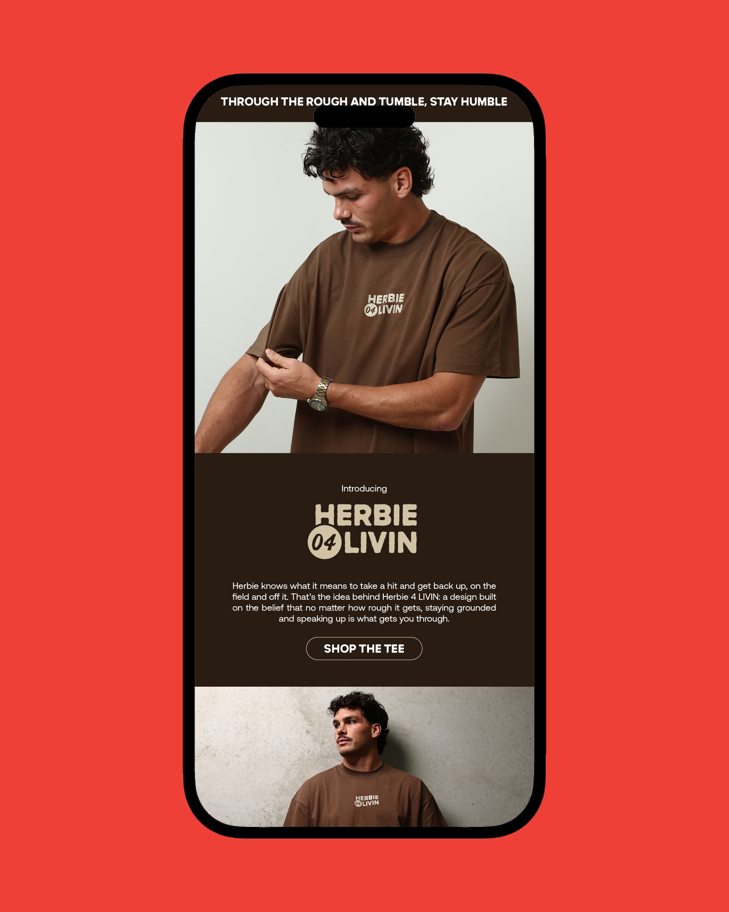
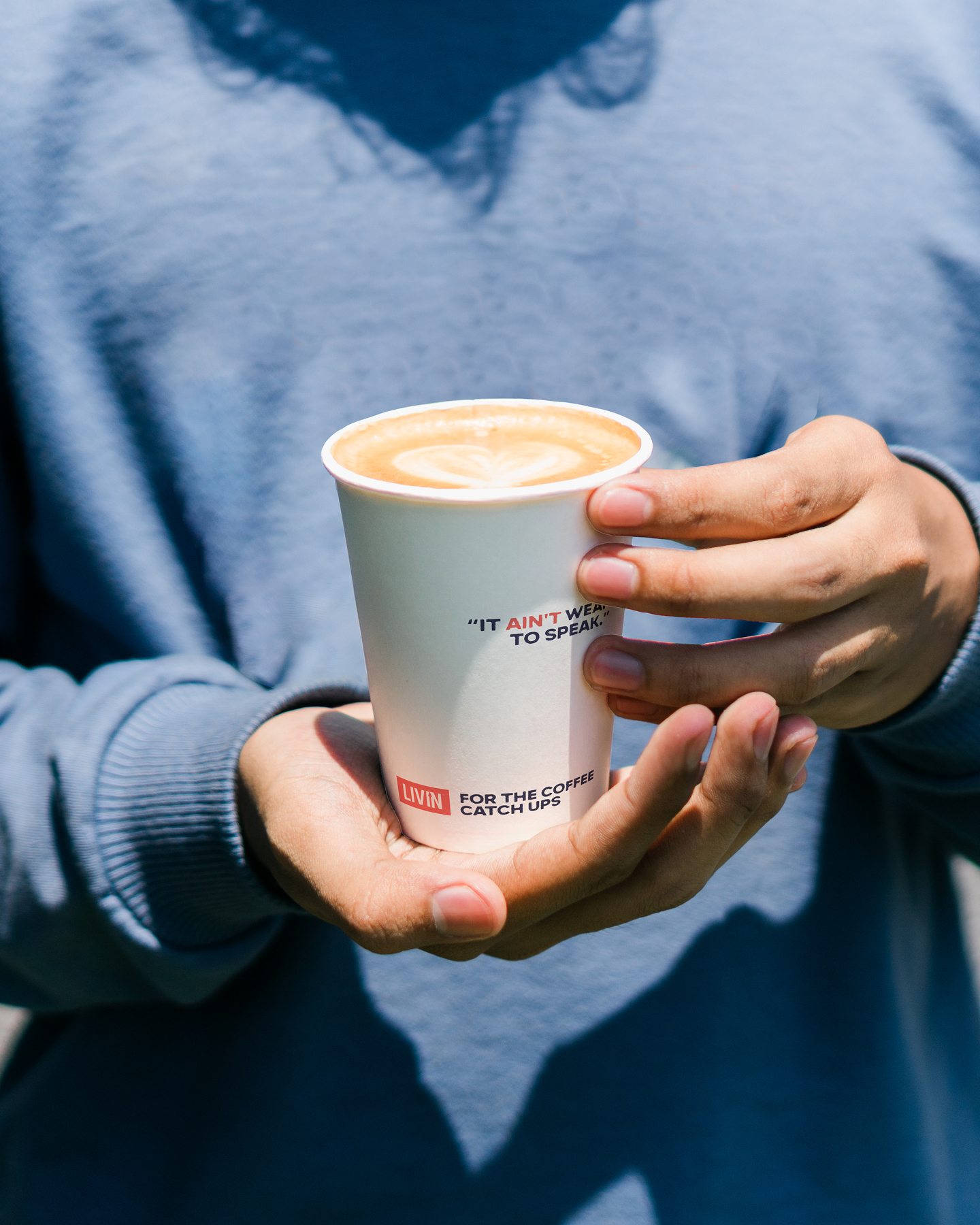
To reach more people, one brand had to feel at home in three very different rooms. A high school hall, where it needs energy. A sporting club, where it needs to be raw and grounded. A corporate session, where it needs polish.
We believe in helping people who help other people, so we took the project on at our Charity Rate. It's there so good people doing good work can get quality branding, whatever the budget.
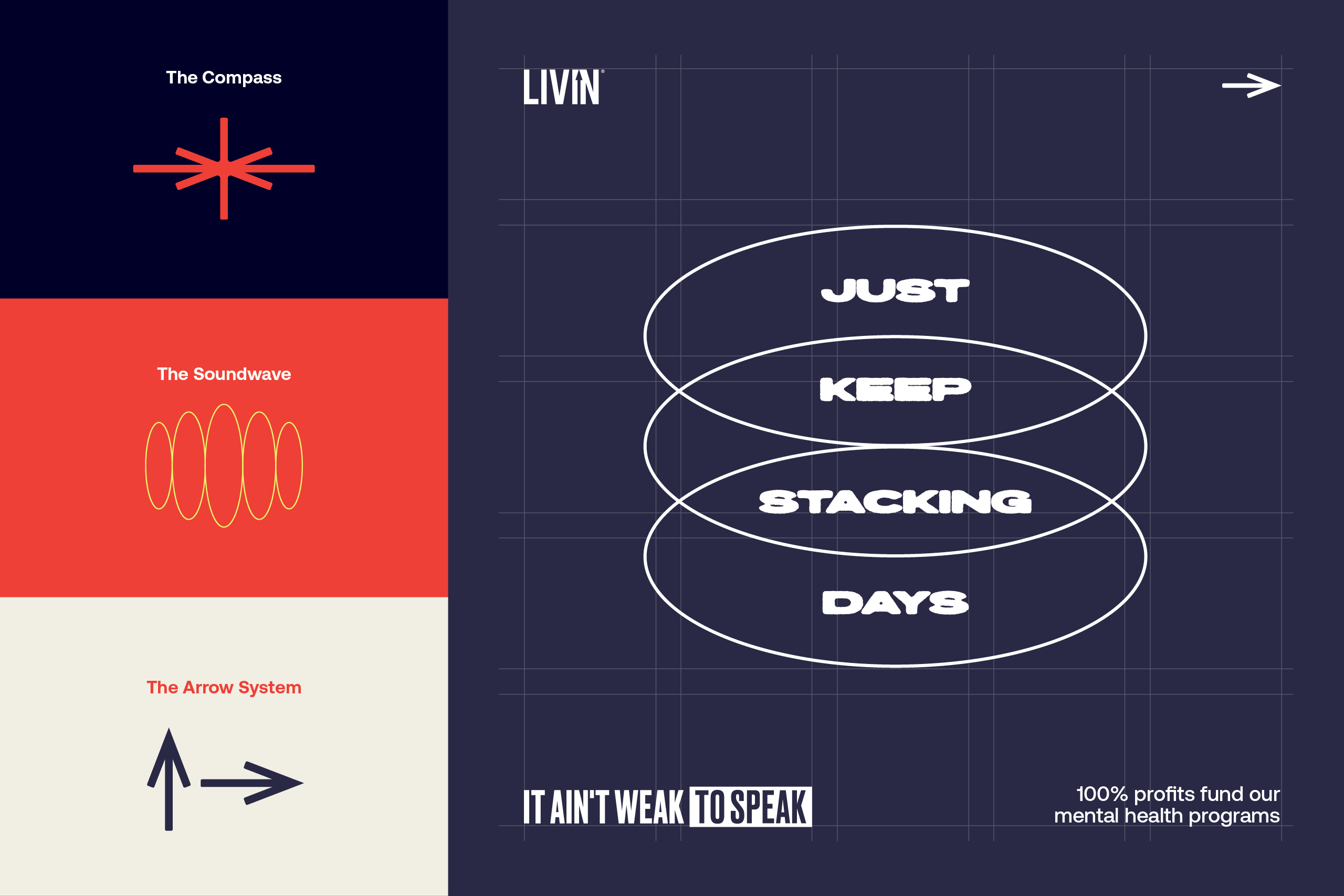
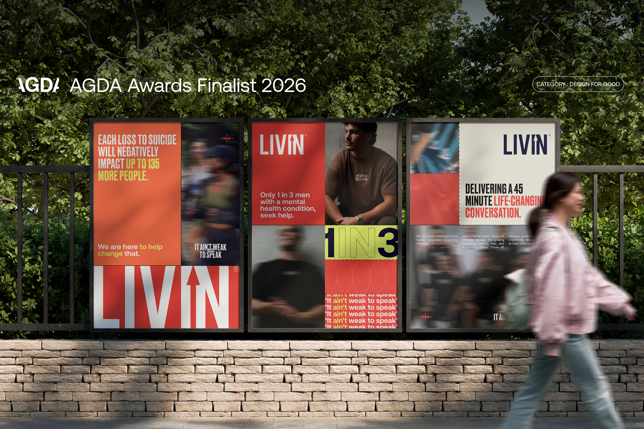
Every 40 seconds, someone in the world takes their own life. Each loss affects up to 135 more people. LIVIN leads with those numbers, so we built an identity strong enough to carry them and hopeful enough to point somewhere better.
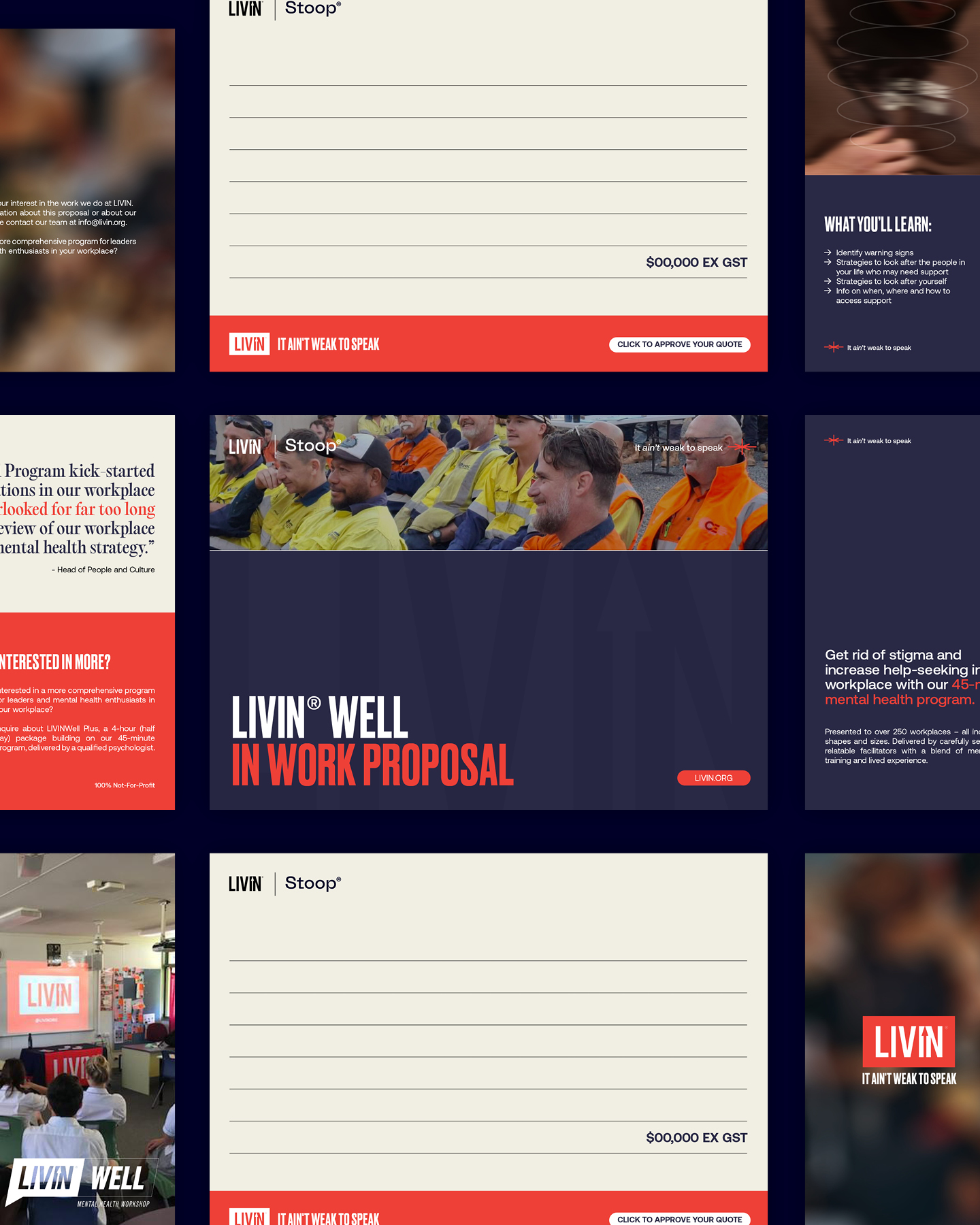
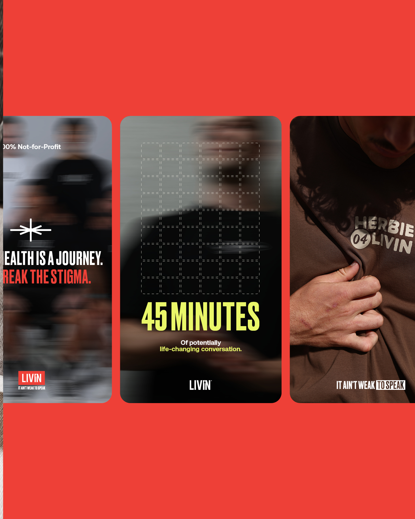
It starts with a modular grid. The blocks rearrange to hold a statistic, a story or a headline, and they carry a meaning of their own. Mental fortitude is built brick by brick. A healthy community is built one connection at a time. Progress is made by stacking days.
Four graphic devices sit on top of the grid:
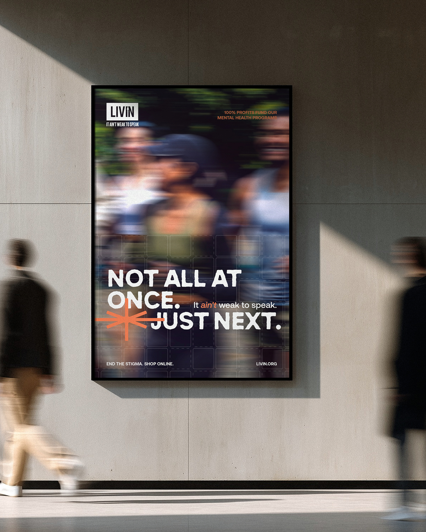
Then there's the imagery. We blurred it on purpose, to show the fog of a mental health struggle and the way stigma distorts things. Put bold type over the top and you get the tension the whole brand runs on. The blur shows the problem. The words give the answer.
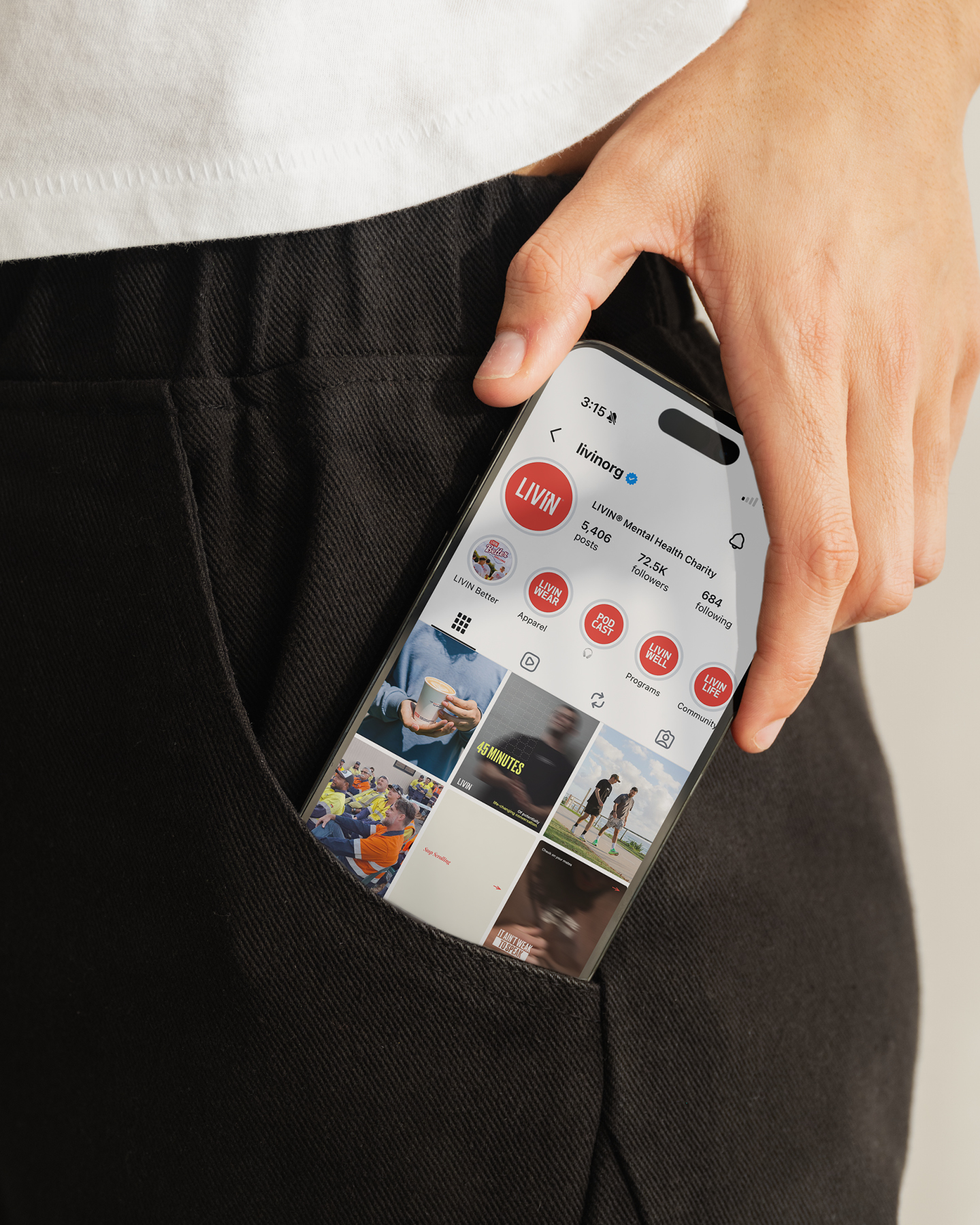
The brand was approved in August and has been rolling out across LIVIN's channels since. Our favourite result so far came from inside the building. LIVIN's marketing team live and breathe this brand every day, and they now have guidelines that are clear, simple and easy to follow. The grid does the heavy lifting on social posts, corporate documents and educational handouts.
We're sticking around to help the team look after it. Making design simple for people who do good every day is about as good as this job gets.